Bleed. CMYK. Vector. Resolution. Fonts.
Those are all common terms that printers and designers throw around like a native language. But what does this mean if your day doesn’t revolve around design and you’re creating a file to send to print a few times a year? Never fear! We’re here to help you translate these terms and get your files into print-ready shape for quicker production and easier proofing.
1. Bleed
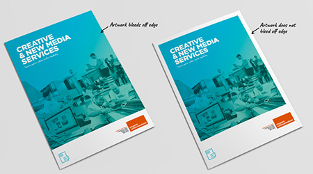
Does your artwork contain images, text, graphics or color that extends to the edge of your finished piece? This is called “bleed” (or “borderless printing”). If you want to achieve the effect of having your design extend off the final trimmed edge, then you need to build an extra 1/8” (0.125” or 12 pixels) or 1/4” (0.25” or 24 pixels) on all four sides of your document. For example, if you are adding a full bleed to your 8.5 x 11” flyer, then your print file will be sized at 8.75 x 11.25”.
But remember to extend only your background artwork all the way out – this is the whole intention behind using the bleed, so when we trim your printed piece, the design falls off the edge. You will want to make sure anything important like logos and text, fall well within your final trim size. If the final document prints at 8.5 x 11”, place the important stuff at least 1/8” inside. Think of it as a forcefield or “invisible fence” situation, you don’t want the vital information getting out of the safety zone.
And when you go to convert your document to PDF format, it’s best NOT to include any crop or printer’s marks. More often than not, those have to be removed by your print vendor in order to format for final production. Because of equipment setup, we will be adding our own trim marks and make sure there are no extra marks in the mix.
Employing these basics to every document you create will ensure that there are no issues with your intention when it comes to trimming and finishing your final piece.
Questions about bleeds? Contact us before you place your order and we’ll be happy to give you some pointers on file setup or sizing so you have the info for future orders as well. After all, the definition of insanity is doing the same thing over and over again and expecting different results.
 2. CMYK, RGB and Grayscale
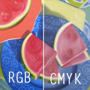
Does your artwork contain more than just black ink? Any files you send that contain color artwork, text or photos should be saved in CMYK (Cyan, Magenta, Yellow, Black) color format. All color swatches within your document should be converted to this color spectrum. If you’re using spot colors, these will need to change to process color. Pantone (PMS) swatches, in particular, can pose problems for color matching when we go to rip the files for final production.
If you’re unsure what colors are spot vs. process, you can PDF your document and then run the “Preflight” function to “Analyze” and show you if there are mismatches. There is an option to “Analyze & Fix” in Preflight, but it’s always best to go back and make permanent fixes in your original document so you don’t have to start all over again the next time around.
Many digital images and art files default to RGB (like cameraphone shots or images downloaded from online sources). And RGB is tempting because the file sizes are smaller and they’re optimized for digital viewing. Converting RGB to CMYK will create a color shift because they don’t fall on the same color spectrum. Sometimes the differences are barely noticeable, but failing to convert can lead to inconsistent results.
If your artwork needs to match other pieces you’ve already produced or you want to add vibrancy after the conversion, we can help. Make sure to drop off an existing piece to us (or any vendor you use) so we can color match if needed. Once you know the CMYK values of your primary color or branding palette, you can apply that to all your pieces for the best print results.
What about Grayscale? Is your piece black and white? Make sure all your linked images and artwork are saved in Grayscale color mode. Turning your design into true grayscale artwork will help the contrast in your images and prevent muddy and inconsistent results. Apply this to logos, photos, backgrounds and accent images to improve the print quality of your piece.
3. Vector vs. Raster-Based Artwork
In a perfect land of wide format printing, most artwork would be vector-based. When artwork is created (or converted) into vector format, it ceases to rely on “artifacts” (noticeable imperfections created by the digital process) and uses mathematics instead. It produces a formula to recreate an image instead of storing the actual image or font. As a result, you can easily manipulate and enlarge vector artwork to any size imaginable. That makes it perfect for creating giant billboards and also allows us to use the outline of letters and images to create cut lines, an especially useful tool for cut vinyl lettering and oversized signs.
In less nerdy design speak, vector graphics resize very cleanly and produce the same quality results over and over again.
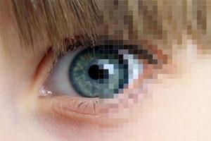
So what about photographs and color images that are much more lifelike and complex? Those are created and processed at a specific size. The complexity of intricate lines, endless colors and depth of field are rarely (if ever) truly matched in vector format. These bitmap (raster) graphics are based on a grid of pixels (which are square points on the screen) that comprise the images we see. We don’t want to “dumb down” the complexity of photographs, so what do we do? Resolution or dpi (dots per inch) become an important factor when prepping files for printing. See below for more.
 4. Resolution or DPI
There’s a near 100% chance at some time in your professional career that you have either submitted something to print, talked to a designer about a project or had to deliver these words yourself: “The resolution of your [photo/image/file/logo] isn’t high enough. It’s going to print blurry or look less than ideal.” If you’re nodding your head in agreement, we feel your pain. When we have to deliver that news to a client who has spent a lot of time working on a project or gathering up the pieces they want to use to create something, we do understand your frustration. Sending your file off to print is often one of the last steps in a sometimes long process, and it’s maddening to hear after you’ve invested so much effort already.
But we’re telling you about quality control problems so you won’t be disappointed with the finished product. For best printing results, file and image resolution of 300dpi is recommended. Files with resolution lower than this can be printed, however, the results may be blurry, rough or jagged looking.
It’s one of the MOST COMMON issues that occurs with file preparation. And here’s why:
- Files downloaded from the internet are generally optimized for only that purpose – to view on a screen. To keep load times down, the file is compressed and the resolution/size is decreased. Something that looks great on your screen, may actually be a pretty small file and won’t reproduce well in print.
- If you’re using your smartphone to take photographs (we ALL do it), you want to set your camera to the highest resolution possible (sometimes noted as HD or in a small/medium/large/original format) when taking the photos. Play with the settings, and if you have a question about quality, send us the image and we’ll be happy to give you some advice on whether or not it will work as is, or if you need to try and retake them.
- Not sure if your image or file will reprint well? There’s absolutely ZERO shame in asking first. We want to produce beautiful work for you that will make you shine. When you’re happy with your finished piece, we’re happy. Anything less than that really isn’t acceptable. We employ a policy to check and re-check files and artwork before they hit our production queue. If we’re unsure about the quality, we’ll be giving you a call. So don’t be shy…we’re here to help.
- When SAVING your files to print-ready PDF, always default to “Press” or “High Quality Print” conversion settings. This will automatically save your entire file with the appropriate resolution, and keep your linked and embedded images from losing quality or becoming blurry.
 5. Fonts. And packaging your files.
Let’s talk about fonts. And links. One of the other most common issues with document printing that arises is missing fonts and links, especially if there’s a small edit to be made after files are submitted for print or we need to adjust a background image in your original, native file.
You’ve possibly heard someone ask you to “turn your fonts to outlines” or tell you “your font is missing” at some point when submitting artwork to print. And you have a couple of options when you’re sending cmyk vsfiles in for production.
“Turn Your Fonts to Outlines”
If you’ve created your artwork in a vector-based program such as Illustrator or CorelDraw or Freehand, and the artwork is heavy on graphics and light on text, this is most certainly a great time to select your text box, go to the Options menu and Create Outlines. It’s especially good if it’s a large or wide format piece – like an oversized poster, sign, banner, wall graphic or window cling. As mentioned above, when the type is changed to vector/outline format, it’s a clean way to resize or enlarge. It also eliminates the need for the recipient of your file to substitute, match or load fonts into the native document. It can be a win/win to drastically reduce production and file rendering issues.
“Your Font is Missing”
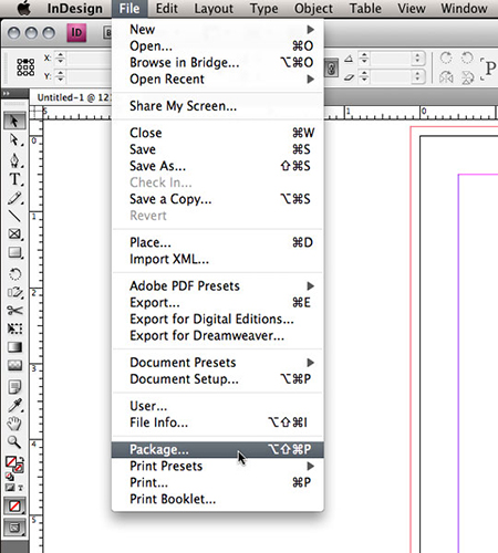
You won’t be receiving this message from us if you’ve embedded fonts when you submit your PDF. Unless…we need to make an adjustment for you. The only drawback with turning all your fonts to outlines? The typeset portion of your artwork is no longer easily editable. If there’s a misspelling, a need to remove information, or a minor error then our options are limited if we need to make a quick fix for you when we have the files in hand. How to resolve that? Package your fonts with your native design files and send the whole thing over.
It’s always advisable to package all your links and fonts for your finished pieces anyway; if for no other reason, then to make sure you have complete files in your own archives. When designing files in Adobe InDesign, Illustrator OR Photoshop, there’s an easy automated method where it’ll do all the work for you. It’s pretty widely known that InDesign will package your files with the press of a button, but did you know it’s an option in Illustrator and Photoshop as well? Adobe has a massive online support database to help you out, or you can go old school and gather up your links and fonts in one spot while you’re working on your files.
One blog post doesn’t quite cover the details that designers spend years learning from experience working with print vendors. But consider this a primer. We’ll be expanding our knowledge base to cover more technical and non-technical topics to help you build more versatile files and design layouts.
Future topics will include preferred file formats, sizing your files, overprint settings, photography tips, layout and design trends, and more. If you have questions about design files or suggestions for topics, please shoot us an email to ask (marketing @ unitedpsg.com)